Sterling Equities
Rebrand
Real Estate Development Firm
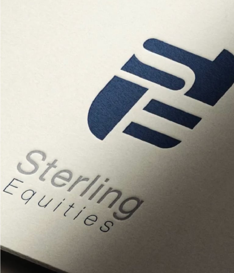
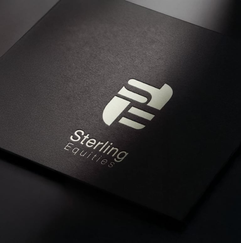
For this spec project, we developed a refined brand identity for Sterling Equities, reimagining the logo to reflect stability, precision, and long term vision within the real estate landscape.
The identity centers on a modern, geometric mark and a restrained color palette, paired with clean typography to communicate confidence, clarity, and institutional credibility.
Every detail was designed to feel intentional and enduring positioning Sterling Equities as a sophisticated, forward-thinking real estate developer grounded in structure and trust.


